RapidMart
role -
ux researcher + sole designer
project duration -
4 weeks
tasks performed -
literature review, field observation, user interviews, ideation, low-fidelity prototyping, hi-fidelity prototyping, user evaluation
team -
abhijeet saxena
deepesh sudhakar
tarang gupta


Project Background
We were given a task to address the problems people face when they perform their grocery shopping. Grocery Shopping is a universal task. On an average, an adult goes to a shopping mart 1.5x a week and spends approximately 50 mins inside a grocery store on a single trip.
The Challenge
Designing an application that will help people in finding items in a grocery store in a more convenient manner, reduce the overall time taken to complete grocery shopping, and a faster checkout experience.
Main Features
In-store navigation map
A navigation map made based on the store layout and items added to cart by the users. Using the map, users can easily locate items inside the store.
Home page
The home page of the app provides different features. Users can directly jump into the navigation map if they have added items to their cart while they were at home. Deals, Purchase History, Shop By Category are some of the other basic features displayed.


Easy payment using QR code
Using the uniquely generated QR code, users will be able to scan the code and pay for the items in their cart. Hence, cutting down on their checkout time.
Process
Research
We started with knowing more about the problem space by reading multiple research papers and online articles regarding the issues faced by people on their grocery shopping trips. We also talked to different people on the issues they face. Explored the challenges and existing solutions that are provided by current applications along with the ideas that worked, those that did not, and tried to understand why. The gathered information helped us in planning the next steps.
-
The average time spent grocery shopping is 41 minutes per shopping trip or over 53 hours per year.
-
When doing grocery shopping online, people tend to spend nearly $40 more.
User Interviews
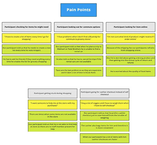
To gather insights regarding the problems faced by users, we conducted 8 user interviews. Key insights that we recognized were:
-
Not able to find the exact location of an item
-
Stores change layout frequently
-
Can't find a store member easily to ask questions
-
Impulsive purchases because of roaming around trying to locate items
-
Self-checkout is not possible when you have a cart full of items (Need a faster checkout experience)
Affinity Mapping
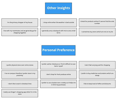
After our contextual interviews, we synthesized our individual notes into synthesis points. We sorted and color-coded them into general groups like - pain points, user-behavior, intent, other-insight, quotes, suggestions, and likes. We then wrote these on a sticky-note paper to assess the repetitiveness of each of these individual note insights, to start seeing patterns. We used the whiteboard to further analyze them and using the bottom-up method we formed themes with ‘I’ statements such as “I make a list on an app to keep track” and so on. We rearranged these themes and formed topic headers for these such as “buying patterns”, “user preference”, “store preference” etc.


Who are the users?
While creating the persona for a grocery shopping experience, we performed user research and identified key elements which affects the users’. The key characteristics identified during our user research will help us in carving out a solution for a grocery store application which the current applications in the market do not have.

Experience Mapping
We used experience mapping to understand what experience our user has when they shop for groceries. It also helped us in understanding the goals, touchpoints, and emotions of our users before and during shopping.

Ideate
To create design solutions, we began to brainstorm and ideate the possible solutions that will solve the user needs. After performing the ideation, we narrowed down our design solution to a mobile app which will be accompanied and supported by a smart-cart.
Smart-cart
.jpg)
The idea of creating a smart-cart is to let the users seamlessly complete their grocery shopping. The concept is that cart will be fitted with scanners using which users can drop the items in the cart and it will be automatically scanned. The scanned item will then be marked as 'Scanned' in the app. At the end, when the users are done with their shopping and ready to checkout, all they have to do is scan the generated QR code in their app at the checkout counter and pay for the amount. The aim is to reduce the checkout time after people are done picking up their items and ready to pay.
Wireframes
After performing the background research, gaining key insights via interviews, and ideating the possible design solutions, I started to create the low-fid prototype for the application.

Home page of the app

Item description

Map layout and item location

Scan QR code and pay
Task Scenario
Matt has his grocery list ready and plans to go to a shopping mart tomorrow. He has three goals:
-
Easily find items in the store that are on his list
-
Complete his grocery shopping in as little time as possible and not get distracted by looking at other products
-
Not face any long lines and issues during checkout
Below is a video of the prototype showing how using the app, Matt was able to accomplish all his goals
Solution Overview
After creating low-fidelity screens/wireframes, I started to design the final hi-fidelity prototype. We were not attempting to revamp the whole experience of using an app while grocery shopping but rather integrating our design solutions into an app experience people are already familiar with.

Home Screen
The home screen contains various elements using which the users can search, locate, and browse items and deals on their favorite items.
The options of scanning the item by barcode to know the information, directly go to the navigation map, browse deals, and shop by category is provided.

Search item list
The items are listed based on the keywords written by the users. Users can directly add the item to cart as well as individually navigate to the item location with the help of Navigate to aisle feature.

Item information
The screen displays the information related to the selected item. Users are given the option to add the item to their cart and select a different quantity if needed. The screen also shows similar items so that the user does not have to backtrack and search for the items again.

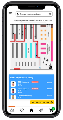
In-store navigation
A navigation path is shown on the map with markings indicating the location of the items in the cart. As the items are scanned using the smart-cart, they are marked as scanned inside the app as well.

Checkout list
After all the items are scanned and users have completed picking up their items, the screen shows the final list of items ready for checkout. Users can remove the items or add more items if needed.
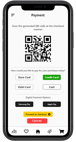
Scanning QR code
A uniquely generated QR code is used to pay for the items at checkout. This method will reduce the practice of scanning each item individually which takes time and leads to long lines at checkout counters.
Evaluation
We conducted usability tests with potential users to understand their insights on our design solutions. They key takeaways were:
-
The users found that the design solutions were very helpful.
-
All of the participants found the functionality of navigation path very unique and believed that it would reduce their grocery shopping time by half.
-
The primary concern was the implementation of smart-cart and the sensors attached to it. During the tests, users were asked to make an assumption that the technology of smart-cart was being used.
Learnings
Grocery shopping seems to be such a mundane and everyday task that people do not really give much attention to how it can be improved. The project provided me with various insights on such a common task. The problems that people have often go unnoticed and being able to address them by creating a design solution was something I enjoyed doing.


.png)


